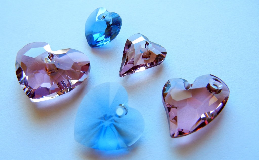
The fashion world is always on fast forward. While we are living in fall 2011 (at least last time I checked!), designers are already planning for fall 2012. Hence the debut of SWAROVSKI ELEMENTS fall/winter 2012/13 crystal colors – *antique pink and denim blue – in fall 2011!
I am actually pretty fond of the 2011 fall Pantone color scheme and its nature-driven hues. “Designers take a painterly approach to fall 2011 by artfully combining bright colors with staple neutrals, reminiscent of how an artist would construct a stunning work of art,” states Leatrice Eiseman, Executive Director of the Pantone Color Institute.
So, although *antique pink and denim blue were designed with next year’s trends in mind, I’m happy to see they coordinate beautifully with the current fashion color trends. Because, really, who can wait until next year to start making jewelry with pretty new crystal colors?
Both *antique pink (a clear crystal with colored coating) and denim blue have a pleasing depth and smokiness that allows them to either blend or pop with a huge variety of color palettes. They also work with both warm and cool hues. And, both look amazing with Vintaj natural brass and antiqued brass plate filigrees!
Behold the rainbow:
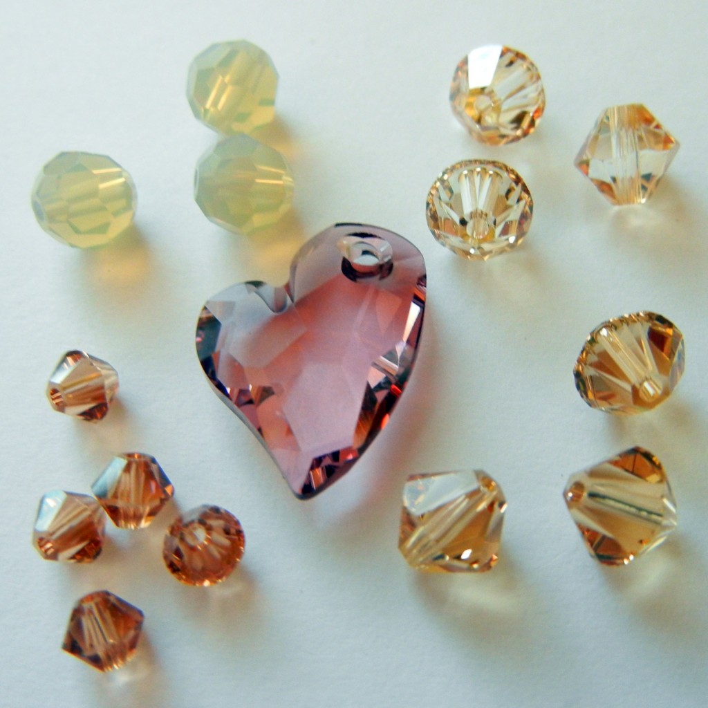
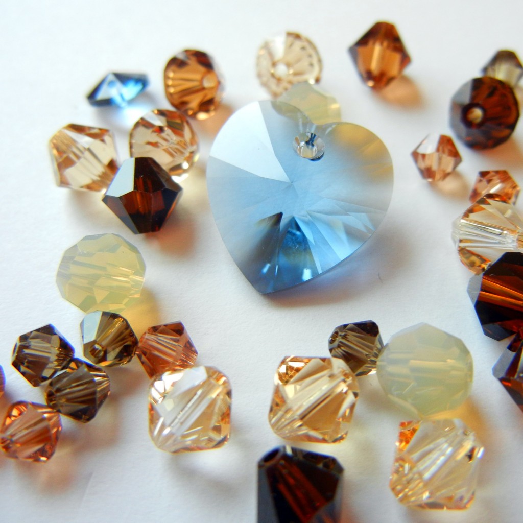
Yummy warm browns (Pantone calls them “Nougat” and “Coffee Liqeur”) are big this fall. Both of the above pictures include crystal/golden shadow, light colorado topaz, light topaz and sand opal. The denim blue crystal mix also has light smoked topaz, mocca and smokey quartz.
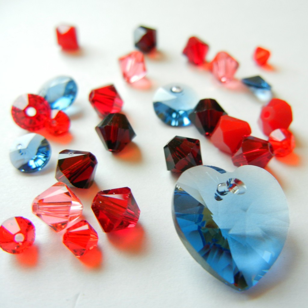
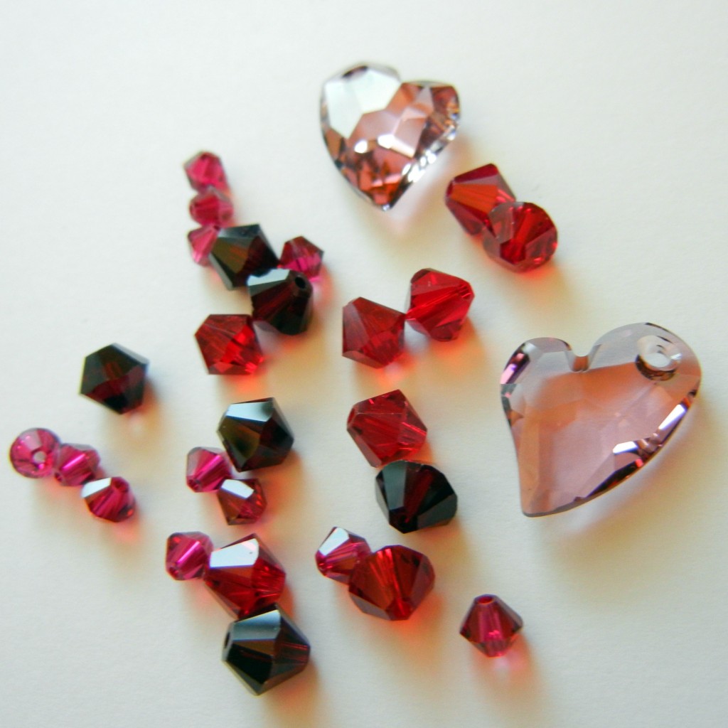
Garnet and siam crystals are featured in both pictures. The denim mix also features dark red coral, light siam and padparadscha (aka Pantone’s “Honeysuckle”). The berry mix uses burgundy and ruby crystals with dusky *antique pink.
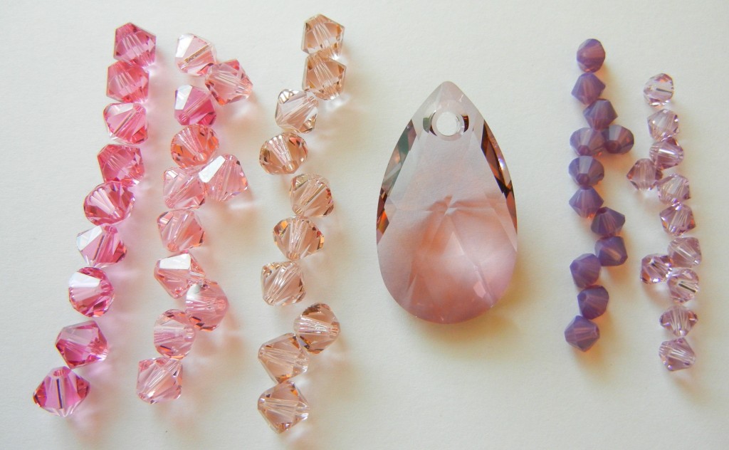
I lined up the “tone on tone” color blend option from SWAROVSKI ELEMENTS to help show where *antique pink falls in their color palette. From left to right, we’ve got rose, light rose, vintage rose, *antique pink, cyclamen opal and light amethyst crystal beads. As you can see, *antique pink has a hint of purple and a smidge of grey to tone down its rosiness.
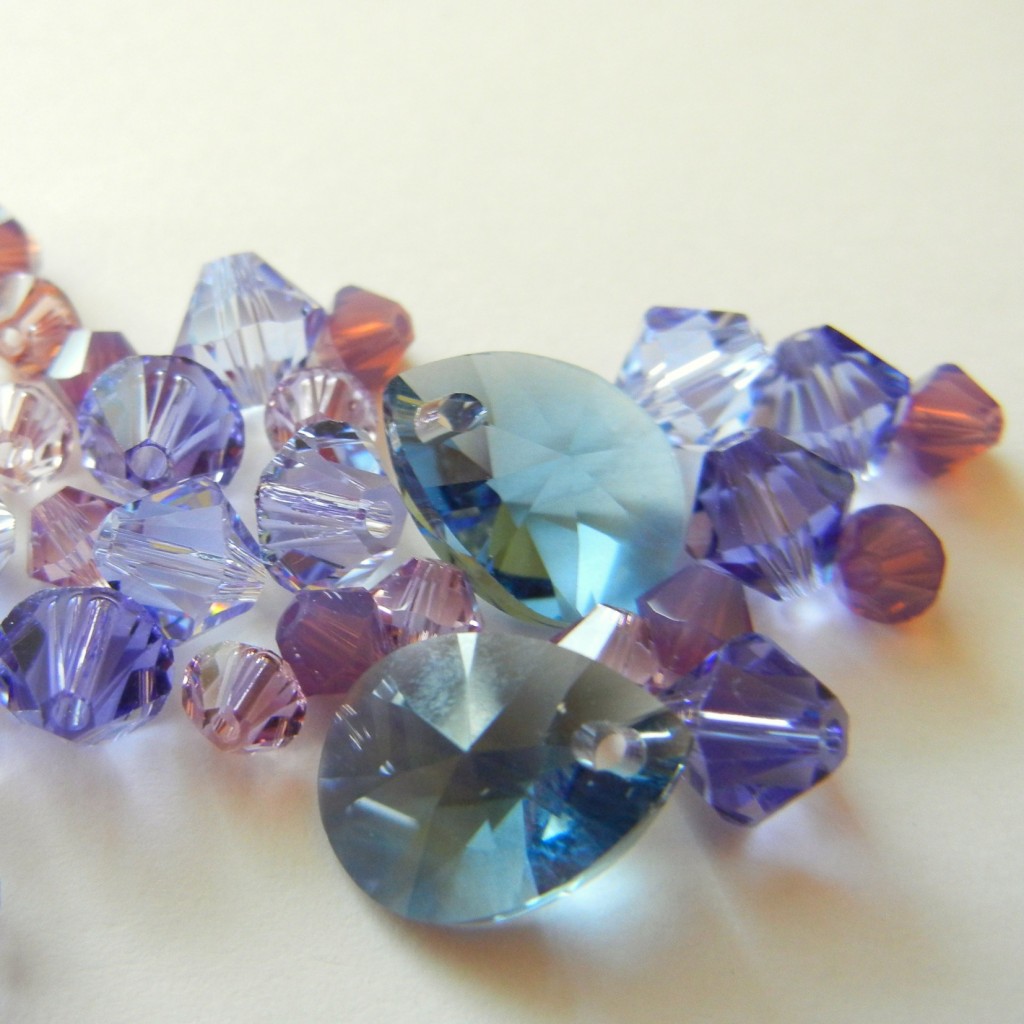
Denim blue looks great with purple crystals, such as violet, light violet, cyclamen opal, Provence lavender and tanzanite. It’s more vivid, but still pairs nicely with Pantone’s “Quarry” blue and purple-y gray “Orchid Hush.”
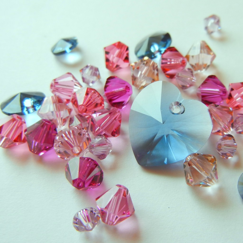
Or, go for more contrast by pairing denim blue with light rose, rose, vintage rose, light amethyst, Indian pink and fuchsia.
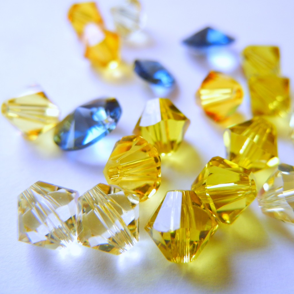
Denim blue with jonquil, light topaz, lime and sunflower (or in Pantone terms, “Bamboo”) crystals is like a burst of sunshine – especially in comparison with the dreary gray sky outside my window!
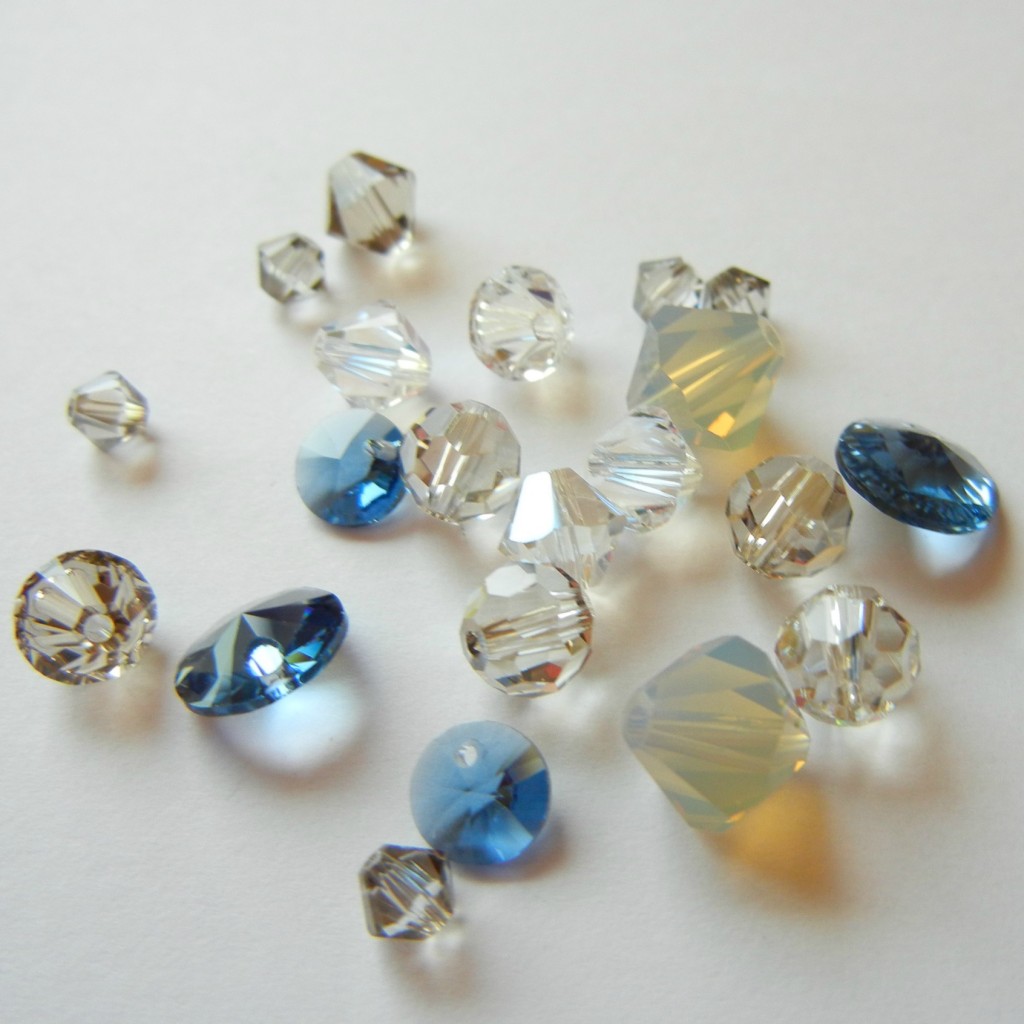
Yet even gray looks less dreary with a shot of blue. Above is a neutral mix of *moonlight, *silver shade, light grey opal, greige and *satin beads.
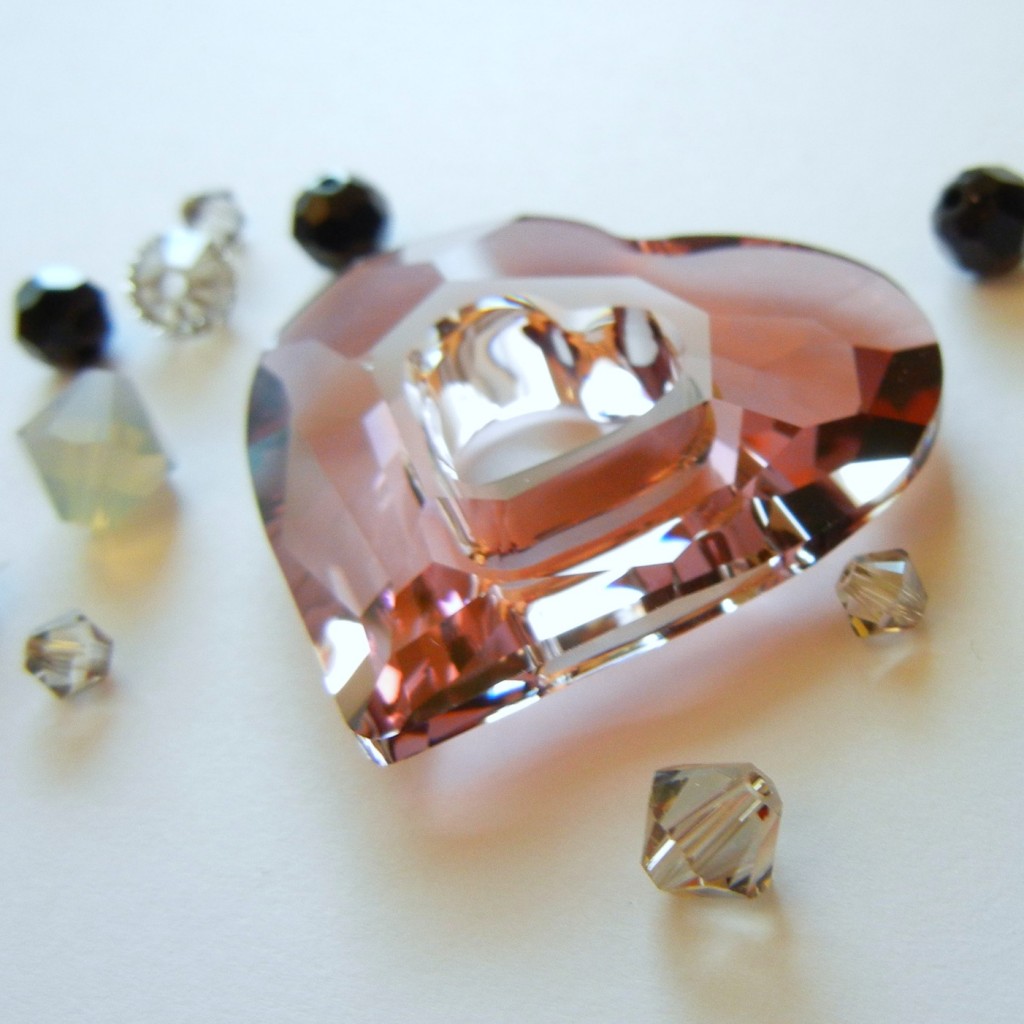
Meanwhile, *antique pink with those same grays and pure jet black makes a decidedly romantic and elegant statement. When the greige crystal color debuted a few seasons ago, I honestly thought Swarovski made up the word by combining “grey” and beige” (hey, they have a lot of power!). I’ve since learned greige is an actual word that describes raw, undyed fabric. I was perhaps a bit underwhelmed by greige (and sand opal and light grey opal, to be honest) when they were unveiled, but I’ve since come to appreciate how well they compliment other more vibrant colors.
Whether you are a slave to fashion or completely oblivious to its fickle ways, it is always nice to have more color options to choose from. These are just a few of the many, many color options using SWAROVSKI ELEMENTS. Hope you’ve enjoyed the crystal eye candy – next week I’ll share some color combos featuring the new petrol crystal pearls on our Facebook page! ~ Cindy


No Comments